OK, here is my process of the making of my tree via adobe illustrator. Sorry for the late updates. I faces some problems more than once while uploading the screen shots before. Again, I want to apologize for the delays...
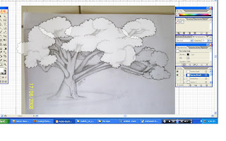
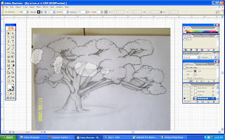
Firstly, as usual I open my sketch of a tree in illustrator as a guide to draw the outline of the tree by using a pen tool.
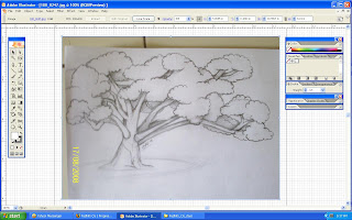
After the outline is drawn, it looks like the image below. I only draw the tree trunk as my 1st layer so that I can easily colour it after I've drawn the whole outline.
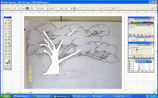
When that is done, I forgot to change the transparency of the pen tool. The less opaque it is, the easier to trace it. So then, I change the opacity before I move on to the next step.
I make a new layer for the branches from my sketch to differentiate the position of the front branches, and the back branches. I also make the last layer invisible to make it easier for me to trace the new layer. In the image shown below, you can see that I've really change the opacity.

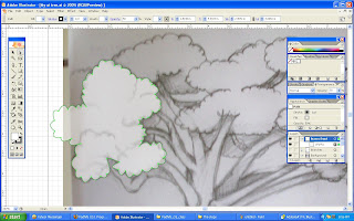
Then I go on to the next layer. I draw the outline of the leaves that will be positioned on the front of the image.
After I draw all the outline of the front leaves, it shall look like this. I then turn it's visibility off like the previous layers.
Next, I draw the outlines for the leaves that I'll place on the back.
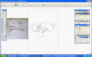
Finally, I've finish drawn the outlines from the sketch of my tree. Well, I didn't arranged the layers yet. that's why it looks a little messy. Do you notices something that I didn't drawn one part from the sketch of my tree..?
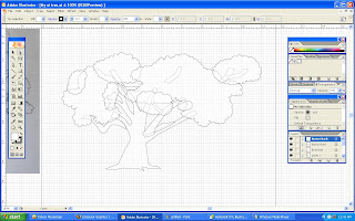
Well, after I arrange the layers, I then apply a little higher stroke for the tree. It will appear as the image below. Now you can compare the 2 images. I didn't drawn the outline of the long branch that bends to the right. The reason is that I think it was way too long. The tree will look unbalanced.
Besides that, I found out that the image of the tree drawn looks tiny on the page (Oh Noo...).
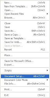
Suddenly, an idea pops up (well...not really). To fix the problem, I click on the File ---> Document Setup.
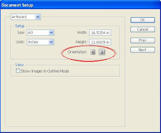
Then, I change the orientation from portrait to landscape like in the circle below.
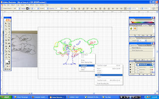
After I change the orientation, the tree still looks small. To enlarge it, I select the whole tree and right-click on it. Then I go to the Transform ---> Scale.
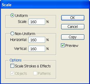
The scale is useful to resize your image without being stretched. Just set the scale percentage to enlarge or minimize the image. For me, I set the percentage of 160 to enlarge my image.
After I enlarge it, It'll look like this. At last, It fits the whole page. (fiuuh...)
Yokai! Now it's time to colour the tree. I had myself searching for a series of green colours to put in the swatches and mix them together to make a gradient.
From the gradient I make, I apply it on the front leaves. I decided to colour the leaves first than the trunk & branches.
After applying the gradients, I make another outline for the leaves so that it look more detailed-looking. This way, the leaves on the tree will not look bored or dull.
Alrite! Since I still didn't know much on how to use the mesh tools, I make a series of trials and errors. The 1st time I use it, I thought (Wow..! looks cool !!). but then, I got some problems to combined it with the overall green colour. (Aargh..!!) The other leaves didn't look well when I apply the mesh tool.
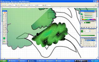
After the leaves, I move on colouring the branches by using mesh tool (still not quite clear on how to use it T_T). Later, as you can see I change the colours of the leaves into just a simple plain colour which listed in the swatches.
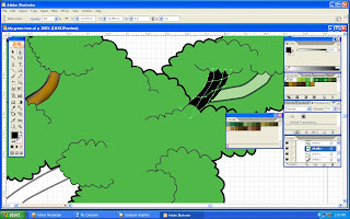
Sadly, I canceled all the colouring that I did using mesh tool. Sometimes less is more, so I just replace it with just simple colours but different brightness to produce a cartoon-like feeling.
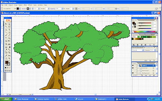
With colouring up a few branches, I finally done colouring my whole tree. Well, but it's still have lacks of details on the surface of the tree trunk. (hmm...)
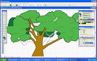
By using pen tool, I draw lots of lines on the surface of the tree trunk to produce some textures. With that, the tree will look more livelier and natural.
For the background, I try to make it simple. So I just put a radial gradient to produce a somewhat looks like a light focusing on the tree. To make the tree looks attach to the ground, I use ellipse tool with brown colour which represnts earth.
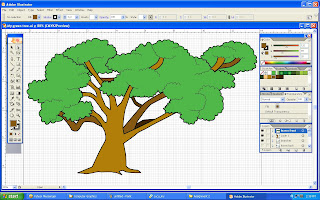
Finally, this is the final outcome for my assignment 2 in MCC0013
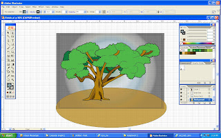
Well, as you can see, above is the image that I've done for my assignment 2. I can't believe it... Doing this simple tree almost make me want to cry. Man... (sigh...)
 Well, In this post I just add my symbol on the artwork. The style I use is a cartoonish look. Nothing much to say about it. I just having a lot of uncomfortable sleep to make this. For the coming assignment 3, I shall put all my heart in doing that! So I'll be able to do better than everything!


