Tuesday, September 9, 2008

The Reason We Breath

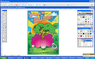
This is my final work. It took quite a long time too to do... But I'm enjoying it. This time I learned more about using the illustrator. The tutorial video really helps me a lot.


Well...it is supposed to look like this when I printed it out. But the font came out different! not like what I did. The fonts change to other fonts and become smaller(*sigh..). I even print it on a glossy paper which cost a lot! But as long as it's still look good, It doesn't matter.

Dr Koo says that I got grammar mistakes.. T_T. And the tag line is not quite clear or understandable. Overall is good but I need to change the tag line and give it more powerful meaning :-)

And so, I should repair a little bit for my poster. I will post it in my blog when I found the suitable tag line.


Oh, I almost forgot the description. here it is:

The big blooming flower with a tree - The birth of a new life. The tree also is a living thing that wants to live on earth and they have their rights to live. They are the reason that we were able to breath until this day. So we should let them breath first (which means to live) then we can breath. So let them grow, Don't take their rights to live away.

The sun rise - The morning view of a new beginning... A new hope. We should change ourselves today to preserve our forest to turn over a new leaf. Also, the sun is placed behind the tree to show that the tree can give us shelter and protects us from the heat of the sun. The tree can rescue us from global warming.
Monday, September 8, 2008

My step by step poster creation

The 1st Volume (the background layers)

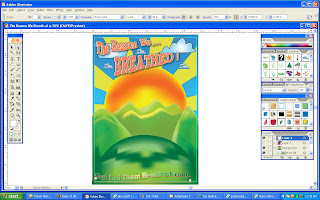
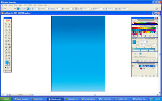
Firstly, I start colouring my background with linear gradient by using a rectangle tool.


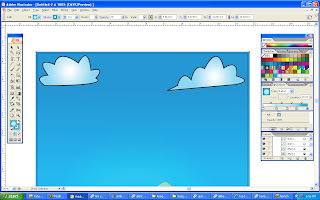
I start to draw 2 clouds using a pen tool and colour it with a radial gradient that I created.


-The Hills-

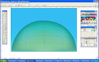
Then, I start to draw a big hill in front (on the bottom of the page) also by using a pen tool. After that I use mesh tool to colour the hill.


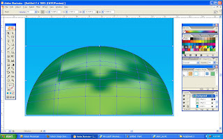
I copy another layer of the hill to make it more visible and better looking. The dark green colour is the shadow of a flower that I'm going to put on top of the hill.


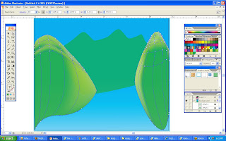
After the front hill is complete, I create some other hills at the back also by using the same method. for these hills, I use a light green to differentiate the position of the hills in my poster.


-The Sun-

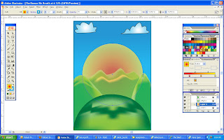
When all the hills have done editing, I then create a sun by using elipse tool and place it behind the last hill. Trying to make the sun looks real, I try to colour it first by using radial gradient only. But then, it seems like the sun lacks of something.

"Maybe I need to create the rays," I thought.

So I download a senior past works and watch some video tutorials to figure out how to make the rays.


After watching the video tutorials and the senior works, I figured out how to do it "my way!."

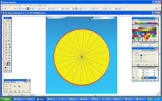
I use a polygonal tool and set it into many edges and try to make the size as close to the sun. Then, I use line segment tool and connect it from one edge to another like in the image above.
When all the edges are connected to each other, I select all the lines and a polygon by using selection tool.

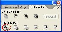
Next, I go to Window -> Pathfinder and click on divide icon as shown on the image above. This will result the polygon to be divided into sections


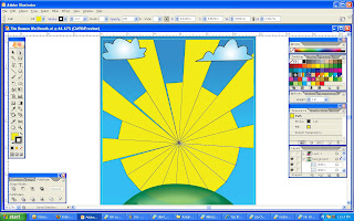
See? In this way, I can drag or edit each sections without affecting other sections. So I use direct selection tool to pull each rays onto the sides of the page. The other sections that I didn't use I just delete them.


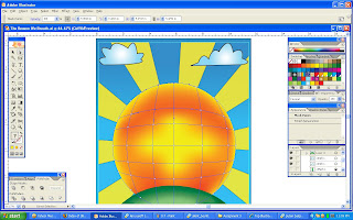
After that, I arrange the sun to position it in front of the rays so that it will look more like a sun rays. Next, I colour the sun again but this time I use mesh tool to make it more realistic.


The 2nd Volume (the flower)

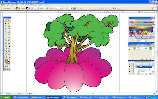
In this layer, I want to create a simple shape flower. I didn't want to trace from images or sketches so I just draw them by using a pen tool.

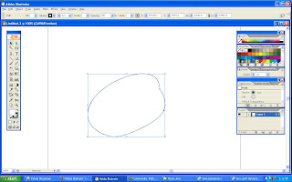
First, I draw one flower's petal by using pen tool.


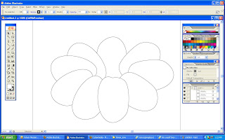
Second, I copy the petal for some amounts, rotate it with different degree and arrange it by layers. Now I can see a shape of somewhat like a flower is produced.


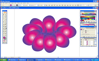
Next, I select all the petals and colour it with radial gradient. But it looks weird because the lighting is not accurate (the gradient effects is in each petals).


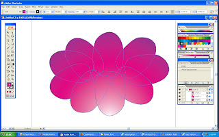
I then use the gradient tool so that I can adjust the gradient effects in any way I want. The outcome is better and more logic than the previous one.


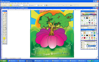
After that, I copy the tree that I created from my 2nd assignment and paste it in this illustrator file. I edited the tree a little bit by adding radial gradient at the trunk and branches so that it can match with the flower. I adjust the stroke on the flower to be the same as the tree so it will not look too different.


The 3rd Volume (fonts, symbols & touch ups)

There are 2 sentence in my poster which I put 1 on the upper part and 1 on the lower part of the poster. For the fonts, It's hard for me to choose since I got more than 3000 of fonts collection. After choosing a suitable type of fonts, I then added a graphic style on the selected fonts after I type the words.


After editing the fonts, I draw a line from the petals by using pencil tool so that it will look more like a flower's petal.

Then, by using symbols I choose 3 types of grass symbol to be put on the hill so that it will look more natural.


The Final Volume (the completion)


So...here it is. The final outcome of my final assignment in MCC0013.

I added up some more symbols just to fill the gaps so that it will not look empty. I also put my symbol at the bottom right corner of the poster.

But something bothers me. When I try to save it in .ai file format, It says that the fonts that I use could not be able to see or something like that. But it's not a big deal (I thought..). So I just ignore it.

Well...I think it's ok I guess. It looks colourful... I try to make this 3rd assignment better to cover up my 2nd assignment which I think It is not good enough... XP. I hope that my explanation is good and understandable. n_n"

p/s: The real thing is, I didn't follow the steps that I explained when I do this poster. I was doing the flower 1st before I draw the hills and so on...(heh2...)

Sunday, September 7, 2008

Assignment 3 Reference on Posters

These are some of the poster examples to spark the plug for my final assignment on Computer Graphics 1. I just want to figure out how the layouts of the poster that I will do.


After browsing at these posters, I still didn't quite clear on the idea & how my layouts should be. Maybe these are not a good examples for my work. So I try to think and sketch my idea on some papers.

I'll upload my sketches later on this post.