Sorry for the late to upload this new adjusted poster. heh... Such a lazy I am. So I have changed the tag line and remove the small trees on the hills behind. The new tag line is "They give out fresh air, to let us BREATH"
This is a blog for my MCC0013 (Computer Graphic 1) class in Faculty of Creative Multimedia, MMU Cyberjaya.

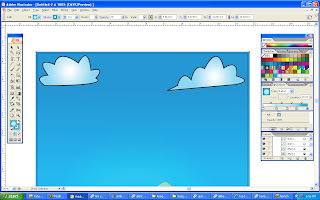 I start to draw 2 clouds using a pen tool and colour it with a radial gradient that I created.
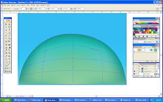 Then, I start to draw a big hill in front (on the bottom of the page) also by using a pen tool. After that I use mesh tool to colour the hill.
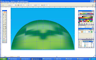 I copy another layer of the hill to make it more visible and better looking. The dark green colour is the shadow of a flower that I'm going to put on top of the hill.
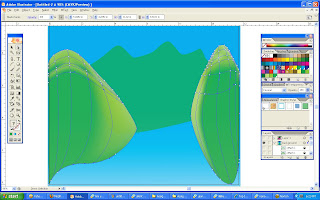 After the front hill is complete, I create some other hills at the back also by using the same method. for these hills, I use a light green to differentiate the position of the hills in my poster.
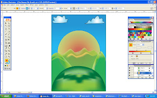 When all the hills have done editing, I then create a sun by using elipse tool and place it behind the last hill. Trying to make the sun looks real, I try to colour it first by using radial gradient only. But then, it seems like the sun lacks of something.
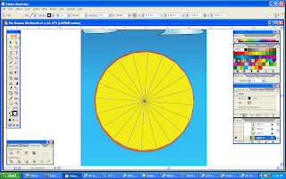 After watching the video tutorials and the senior works, I figured out how to do it "my way!."
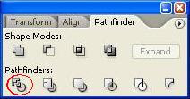 Next, I go to Window -> Pathfinder and click on divide icon as shown on the image above. This will result the polygon to be divided into sections
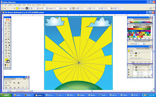 See? In this way, I can drag or edit each sections without affecting other sections. So I use direct selection tool to pull each rays onto the sides of the page. The other sections that I didn't use I just delete them.
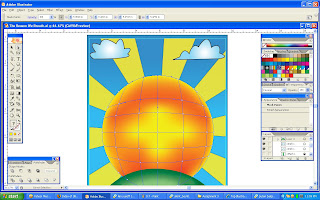 After that, I arrange the sun to position it in front of the rays so that it will look more like a sun rays. Next, I colour the sun again but this time I use mesh tool to make it more realistic.
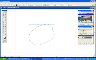 First, I draw one flower's petal by using pen tool.
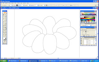 Second, I copy the petal for some amounts, rotate it with different degree and arrange it by layers. Now I can see a shape of somewhat like a flower is produced.
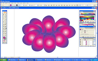 Next, I select all the petals and colour it with radial gradient. But it looks weird because the lighting is not accurate (the gradient effects is in each petals).
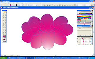 I then use the gradient tool so that I can adjust the gradient effects in any way I want. The outcome is better and more logic than the previous one.
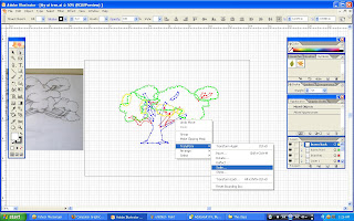
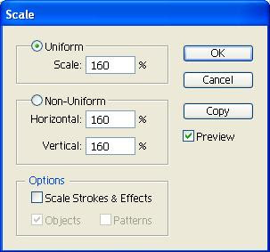
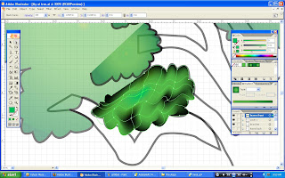
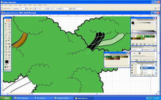
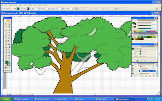
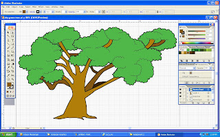
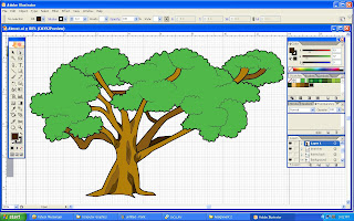
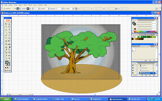
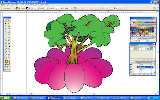 After that, I copy the tree that I created from my 2nd assignment and paste it in this illustrator file. I edited the tree a little bit by adding radial gradient at the trunk and branches so that it can match with the flower. I adjust the stroke on the flower to be the same as the tree so it will not look too different.
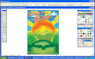 There are 2 sentence in my poster which I put 1 on the upper part and 1 on the lower part of the poster. For the fonts, It's hard for me to choose since I got more than 3000 of fonts collection. After choosing a suitable type of fonts, I then added a graphic style on the selected fonts after I type the words.
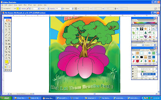 After editing the fonts, I draw a line from the petals by using pencil tool so that it will look more like a flower's petal.
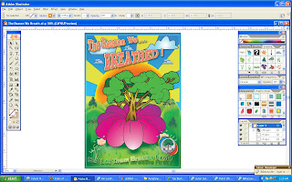 I added up some more symbols just to fill the gaps so that it will not look empty. I also put my symbol at the bottom right corner of the poster.


 Well, In this post I just add my symbol on the artwork. The style I use is a cartoonish look. Nothing much to say about it. I just having a lot of uncomfortable sleep to make this. For the coming assignment 3, I shall put all my heart in doing that! So I'll be able to do better than everything!
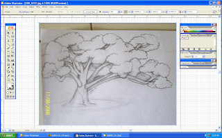
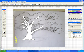
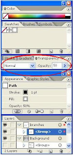
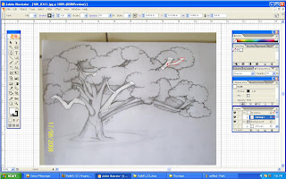
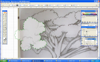
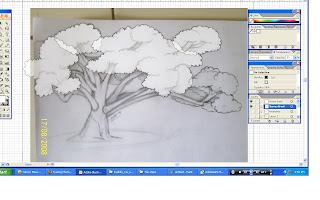 Next, I draw the outlines for the leaves that I'll place on the back.
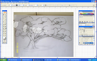
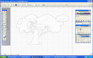
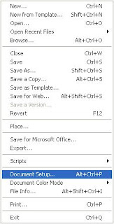
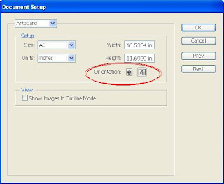
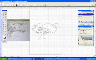 Suddenly, an idea pops up (well...not really). To fix the problem, I click on the File ---> Document Setup.